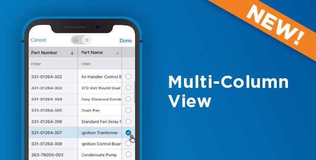
We have some pretty outstanding news to share with you: we recently added a new Multi-Column View feature to our Enterprise tier! This will allow you to streamline your mobile forms, thus making them easier to navigate.
Multi-Column View is a new data source option for lookup questions (e.g., dropdown, radio button, etc.). It allows a form to display up to three columns from the data source to help users select the correct answer.
The challenge
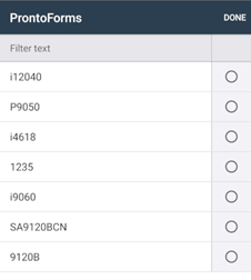
When field engineers needed to select an option from a lookup question in the past, they usually had to pick a choice from a list. Unfortunately, this method wasn’t very user-friendly. For example, here’s a list of model numbers from the Android app:

There is not much context here, as you can see from the screenshot. A data source can provide vital information, like a part’s brand or quantity that is on hand, that can be vital to getting the job done efficiently.
Our solution: Multi-Column View
Clearly, we had to find another way for form builders to provide more information to their users.
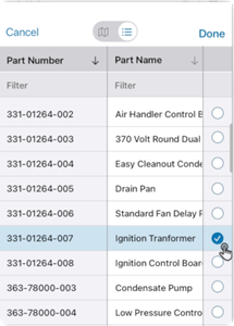
Now, you can select up to three columns of data to display in the app when a user opens a dropdown question. The field engineer now has more context with more columns, and they can sort them, too. Here’s an example of the updated feature at work in a sample data source for part numbers:

Multi-Column View certainly makes forms much easier to navigate, doesn’t it? We certainly think so. Using this new feature, which is available to all Enterprise tier users, you’ll be able to display an unlimited number of columns in the output documents. Also, this feature doesn’t affect output documents.
Check out our Product Documentation portal for a more in-depth look.


